
White space, often referred to as "negative space" or "open space," is a critical element in effective web design, particularly for Christian websites aiming to create a welcoming and engaging online environment. Proper utilization of white space enhances readability, guides user experience, and helps convey religious messages more effectively.
Key Takeaways
- Understanding White Space: White space is essential for creating balanced and user-friendly web designs; it is not merely empty space but a valuable component for organization and clarity.
- Impact on Readability: Properly spaced text can enhance readability by up to 20%, helping to combat information overload on Christian websites.
- Creating Focal Points: White space can elevate important elements such as CTAs (Call-to-Action buttons) and headers, effectively capturing visitors’ attention.
- Visual Hierarchy: Intelligent use of white space guides users through content, establishing a visual hierarchy that enhances the navigation experience.
Learn more about effective web design practices on ipsom.io.
The Role of White Space in Web Design
White space, also known as “negative space,” is a vital component of effective web design. It refers to the empty area surrounding elements on a webpage, and its significance extends beyond mere aesthetics. Proper use of white space promotes clarity and organization, creating a visually appealing and user-friendly interface that resonates with visitors, especially on Christian websites.
Definition and Importance
White space consists of any area on the webpage that is devoid of text or images. It is not just an empty void but a critical design element that contributes to the overall user experience. By employing white space strategically, designers can create a balanced layout that guides users and reduces cognitive overload. This enhances user engagement and enables visitors to absorb the website's religious messages with ease.
Enhancing Readability
The presence of white space significantly enhances readability by providing breathing room for text blocks and images. Research indicates that proper spacing can improve reading comprehension by up to 20%. White space helps users scan content quickly, making it easier to locate important information. By effectively managing clutter through the use of white space, designers can focus user attention on key messages and calls to action, leading to higher user satisfaction and interaction on Christian websites.
Psychological and Design Principles
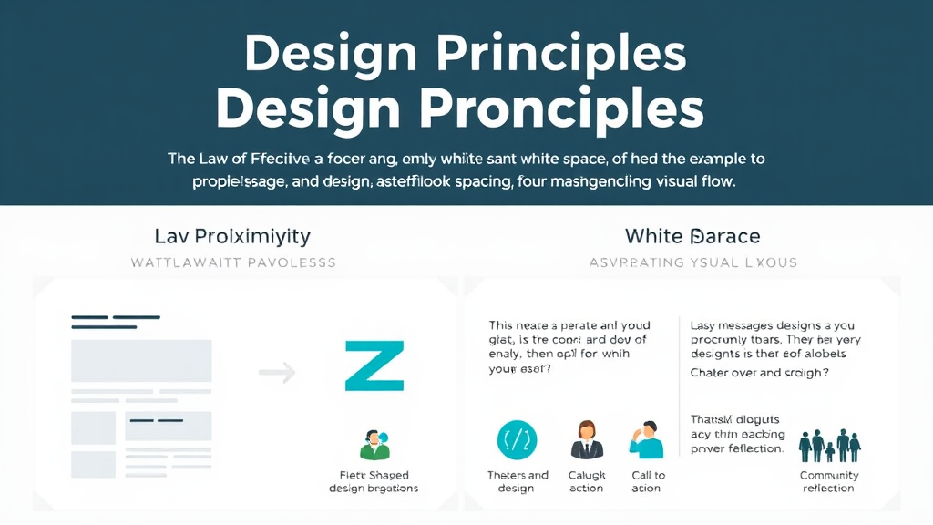
The Law of Proximity
-
Law of Proximity: States that elements that are close together are perceived as related.
-
Impact of White Space: Proper use of white space can significantly influence how users interpret relationships between visual elements.
-
Strategic Spacing:
- Creates effective visual groupings.
- Establishes a clear hierarchy.
- Helps users identify the importance of each section.
-
Religious Web Design:
- Emphasizes key messages and calls to action.
- Allows visitors to focus on what truly matters.
-
Consequences of Clutter:
-
Without enough space, elements may appear cluttered.
-
Can lead to confusion and disengagement.
Visual Flow and Navigation
-
Effective White Space: Creates a visual flow that guides users through your content.
-
Layout Strategies:
- Z-shaped layouts: Lead the viewer's eye in a natural way.
- Asymmetrical layouts: Enhance the reading experience and navigation.
-
Engagement:
-
Smooth navigation increases the likelihood of visitors engaging with content.
-
Enables performance of desired actions, particularly on Christian websites.
- Importance in Design:
- Prioritizing white space optimizes user interaction.
- Makes the experience enjoyable and meaningful, especially for community engagement and spiritual reflection.
Implementing White Space Effectively
Implementing white space effectively can transform the user experience of Christian websites. It creates balance and enhances content focus. Here are practical strategies to make the most of white space in your design.
Practical Strategies for Design
Start by determining the optimal spacing between content elements. A good rule of thumb is to maintain at least 20% white space around critical components such as text blocks and images. This spacing guides the eye and reduces cognitive load. Use grids to organize your layout, allowing for consistent margins and padding across pages.
Creating focal points is essential. Highlight key elements like Call-to-Action buttons and headings by surrounding them with ample white space. This draws visitors’ attention and encourages them to take action.
Examples of Effective White Space Use
Many successful websites leverage white space effectively. For instance, Pottery Barn's site utilizes generous spacing to instill a sense of luxury and trust. In contrast, a cluttered design like that of Rooms to Go can overwhelm users.
Effective use of white space builds a perception of quality and reliability, critical for Christian organizations looking to establish trust. Case studies highlight how clean, organized designs employing white space can significantly improve user engagement and retention.
Emotional and Spiritual Significance of White Space
White Space Beyond Design
-
Balance in Life: White space reflects the importance of maintaining balance in our personal and professional lives.
-
Clarity in Relationships: Similar to how white space enhances clarity on websites, it encourages clarity in our interpersonal connections.
-
"White Space Moments": Intentional pauses can lead to deeper relationships and personal reflection.
- Encourages time for healing and introspection.
-
Creating Mental and Emotional Space:
- Prioritize Downtime: Essential for self-care and mental health.
- Engage in Spiritual Practices: Activities like meditation or prayer help reconnect with core values.
-
Enhancing Well-Being: Achieving calm and clarity can significantly improve overall well-being and foster stronger spiritual connections.
Encouraging Engagement
-
Inviting Atmosphere: Utilizing white space on a Christian website creates a welcoming environment for visitors.
-
Navigation and Exploration: Ample negative space and organized content encourage users to spend more time engaging with the site.
-
Visual Integrity:
- A well-structured layout effectively conveys spiritual themes without overwhelming users.
- Balance Between Text and Visuals: Ensures clarity and better understanding of religious messages.
This thoughtful use of white space nurtures a more impactful engagement, allowing users to connect more deeply with the site's message.

Common Pitfalls and Mistakes
In web design, common pitfalls regarding white space can lead to significant issues. Neglecting white space can result in a cluttered interface that hinders user engagement. When elements are overcrowded, visitors often feel overwhelmed and confused, ultimately leading to higher bounce rates. Research shows that a well-structured design can improve trust and usability by as much as 30%, making the effective use of white space vital.
Red Flags in Design
Some red flags to watch for include excessive text without breaks and poorly spaced navigation menus. These issues can decrease the site's credibility. A cluttered design dilutes your message, making it harder for visitors to identify critical content. Ensuring adequate spacing encourages visitors to explore rather than exit quickly.
Improving Through Design
To enhance user experience, implement a consistent spacing system across your website. This system ensures that spacing feels deliberate and organized, creating a cohesive feel throughout all pages. Balancing usability and aesthetics is essential; thoughtful use of white space can make the layout both pleasing and intuitive. By following established guidelines, designers can create lasting impressions that foster deeper connections with users and enhance overall site performance.
Conclusion
Embracing white space as an asset is crucial for creating effective and engaging web designs, especially for Christian websites. Designers should view white space not as merely wasted space but as a critical component of a cohesive layout. This perspective enhances the user experience and promotes clarity throughout the website.
White space plays a vital role in building relationships and trust with visitors. A well-designed site using white space fosters an inviting atmosphere that encourages users to explore and engage with the content. This emotional connection can significantly impact a website's effectiveness and its ability to convey important religious messages clearly. Effective use of white space allows for reflection and understanding, making the online experience more meaningful for users seeking spiritual guidance.